I suppose one could simply say that the Garmin Venu was simply just a Vivoactive 4 with a really beautiful vibrant display, but then you’d skip reading over the remaining few thousand words and photos of this post. And nobody would want that, despite how precisely true those words were.
So instead, we’ll step back a bit and explain what the Venu is from a feature standpoint. I’ll show you its extremely strong lineage to the Vivoactive 4 (and the Vivoactive 3 of yesteryear), and show you that despite having an AMOLED display, it still has an always-on screen if you want it. So now there’s no required decision between pretty screen and always-on. Though, in some ways, there still is. And I’ll explain how these days on the Vivoactive/Venu lineup, music comes standard. As does a pile of new features related to other workout types like yoga & pilates with animated step by step workout move instructions, 24×7 respiration rate tracking, estimated sweat loss and finally hydration tracking.
So with all that, let’s get straight into the newness. Note that I have had a unit for the last couple weeks. And normally at this point I’d be doing an in-depth review, but simply put this product isn’t ready to ship. So since it’s not ready yet – I’ll wait for final firmware and hope to complete an in-depth review sometime in September.
What’s new:
As you’ve probably gathered by now, the Venu is a progression of the Vivoactive lineup. It and the Vivoactive 4 share virtually every feature, with the only differentiating aspects of the Venu are those that are specifically display driven. So such things like higher quality animations and better quality watch faces. In discussing the features with Garmin, there are no non-display associated features that are in Venu that aren’t in Vivoactive 4, or vice versa.
The other thing to note is that previously there were separate editions of the Vivoactive lineup – one for music (e.g. Vivoactive 3 Music), and one for non-music (Vivoactive 3), now that’s all under a single umbrella with music – whether you have Venu or Vivoactive 4. On the flip-side, you now have two different sized units, and things cost more. The pricing is as follows:
US Pricing:
Venu: $399
Vivoactive 4/4S US Pricing: $349
EU Pricing:
Venu: €349 & €379 depending on bezels/buttons
Vivoactive 4S: €279 & €299 depending on bezels/buttons
Vivoactive 4: €299 & €329 depending on bezels/buttons
With that, let’s talk all the new offerings in relation to the past model – the Vivoactive 3:
– Music now standard: Including Spotify, Amazon Music, Deezer, and iHeartRadio
– Venu features 1.2” AMOLED display: Super vibrant, lots of colors
– Venu also adds ‘always-on’ mode despite AMOLED display
– Added ambient light sensor tied to new display
– Added new ‘Live’ Watch faces with small animations
– Added secondary button to side: Used for lap, back, menu access
– Added hydration tracking to manually track liquid intake with widget and app
– Added Estimated Sweat Loss post-workout
– Added Respiration Rate for all-day and sleep metrics (and certain workout types)
– Added Breathwork Exercises (way different than simple breathing stress features)
– Added Workout Animation functionality: For Strength, Cardio, Yoga, Pilates
– Added new Yoga and Pilates Built-in workouts: Includes step by step animations
– Added ability to design Yoga workouts in Garmin Connect: Complete with step by step pose animations
– Added ability to design Pilates workouts in Garmin Connect: Complete with step by step animations
– Added PulseOx for 24×7 blood oxygen tracking
– Revamped health stat widget akin to latest Fenix/Forerunner models
– Switched to Sony GPS chipset like remainder of Garmin 2019 unit lineup
– Switched to Garmin Elevate V3 optical HR sensor
– Connect IQ Developers will have access to create live watch faces
– Battery life at 5 days standby, and 6 hours of GPS+Music
As you can see, the vast majority of new features on the watch are far less focused on the swim/bike/run athlete that’s more common in Garmin’s Forerunner and Fenix lineup, and instead focused on a bit more of the lifestyle athlete that may be more varied in their day to day activity – which to be fair, was always the strength/target of the Vivoactive lineup, as this is within that family.
For those not familiar with the Vivoactive lineup, here’s all the baseline features found on both the Venu & Vivoactive 4:
– GPS tracking of activities (no reliance on phone)
– Workout tracking of range of sports including running, cycling, pool swimming, skiing, golf, gym and many more (full list down below)
– Structured workout support via downloadable workouts
– Quick on the fly intervals
– Training calendar support
– Optical heart rate sensor in watch
– 24×7 tracking of steps, stairs, calories, and distance
– Smartphone notifications from iOS/Android
– Garmin Pay for contactless payments
Ok, with all that out of the way, we’ll dive into the details. But first, one more thing:
Yes, the Garmin Fenix 6 Series & Forerunner 945 will get *all* of the new features noted above (except the display of course, and the live watch faces, which require the AMOLED display). For the Fenix 6 series, that update is slated for here in September, whereas for the Forerunner 945, that update is expected this fall.
Hands-On Details:
For this post I’m mostly focusing on the new things. In my full in-depth review I’ll cover all the basics of using the watch that are more or less the same on every Garmin watch.
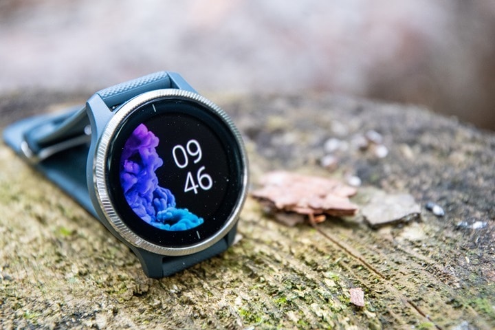
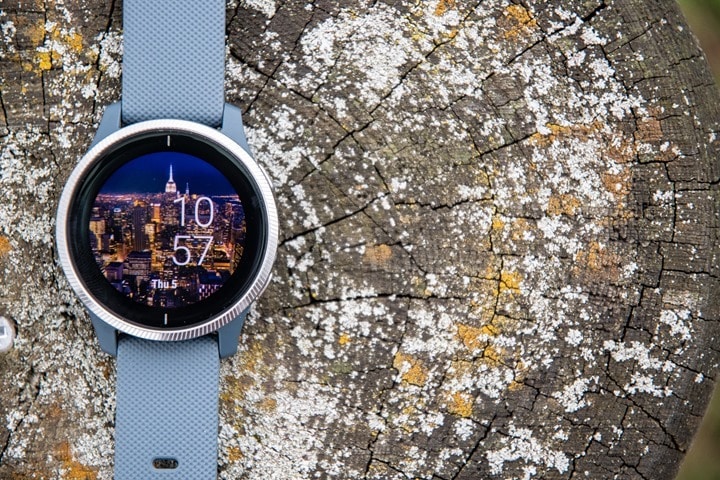
There’s a pretty strong chance that if you’re seeing a review on the Venu, it’s going to start with the watch face. That’s logical for two reasons, for of all – it’s by the prettiest thing on the watch, and second of all – it’s the first thing you see. You’ll see it above in fact. And, if you check out my video, you’ll even get to see the nifty animation in the first 4 seconds of the video. Again, sexy animations sell. Or something like that.
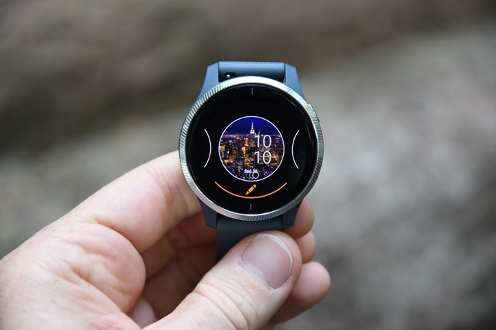
And, there’s even more animations you can choose. They are technically called live watch faces, and you can lightly customize some of them:
Keep in mind that live watch faces do eat into battery, as you might expect. There’s also more boring regular watch faces too.
And it’s about at this point that we should mention that I’d argue is Venu’s most important feature: The ability to turn on the always-on display. See, unlike watches from Apple and Samsung, Garmin joins Fitbit in perhaps a new trend of allowing these AMOLED displays to be left on the entire time. Of course, all of Garmin’s previous watches had always-on displays, but it’s not super common in the fancier display market.
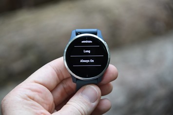
With the Venu you can enable a low-power always-on watch face. Garmin claims about 2-3 days in this watch-face mode, but I think it’s actually a bit better than that depending on your nighttime settings:
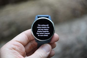
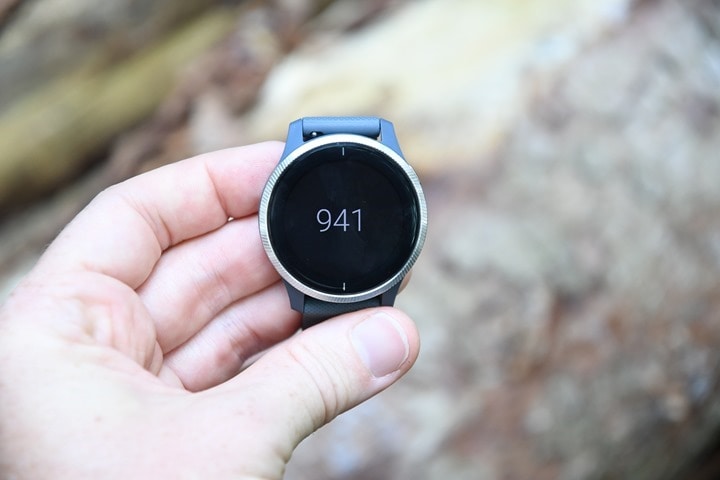
The reason the night settings matter is that when you’re within the ‘Do not disturb’ window at night (that you’ve configured), it’ll turn off the display entirely. This is a relatively smart move that saves battery life and also keeps the watch from becoming a constant flashlight. Here’s what that reduced watch face looks like (it’s slightly different for each one, and essentially keeps the time in the exact same spot as the original watch face):
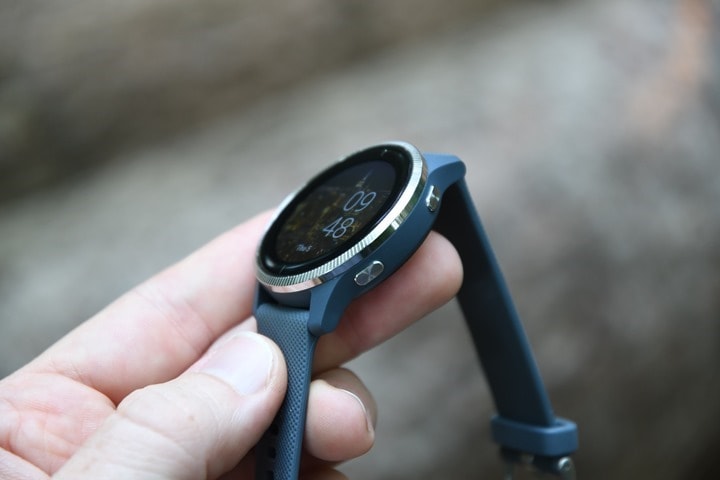
Next there are the buttons. There’s two of them now, versus the previous single button on the Vivoactive 3. It’s a nice touch, and really makes navigation so much more efficient. Folks coming from other Garmin watches will find it far more natural too:
The upper right button is the start/stop/confirm/enter type button, whereas the lower right button acts like a back/lap/escape function. As well, obviously, the touch screen is how one would scroll up and down in the various menus. Again, works great.
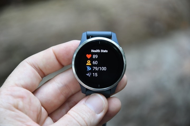
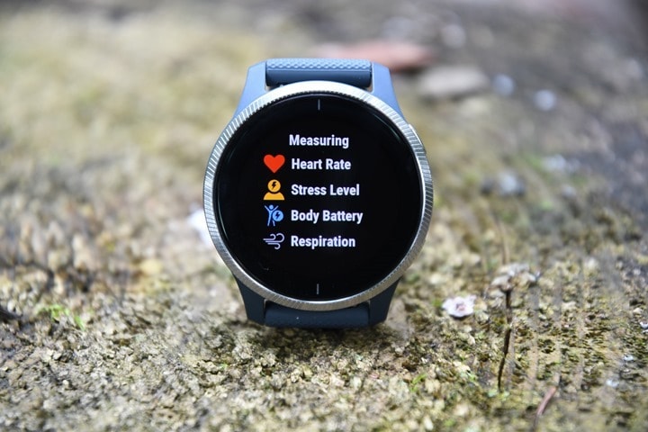
Next we’ll get into some of the new health features, starting off first with the refreshed and consolidated health stats widget. This falls inline with other Garmin wearables and allows you to see things like heart rate, stress, body battery, and breathing rate in one quick glance:
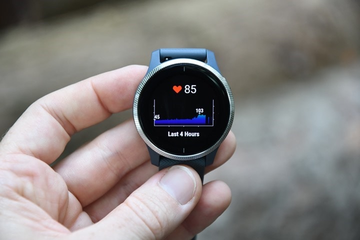
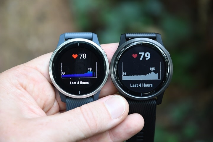
There’s also the brilliantly pretty looking heart rate graph. This is one of the few places in the watch that the AMOLED display really shines:
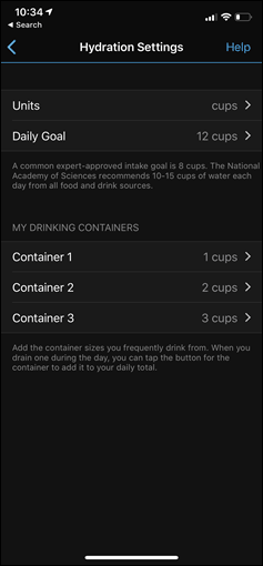
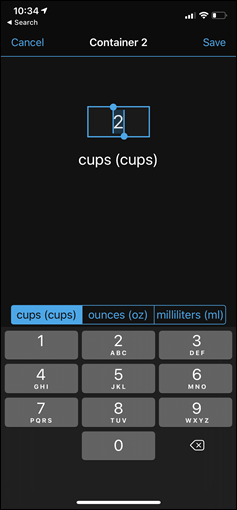
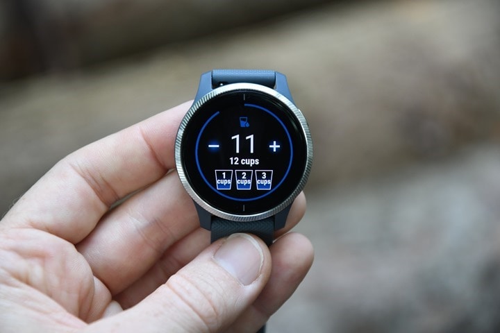
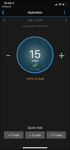
You’ll find yourself a new hydration tracker widget. The way this works is that you define three ‘vessels’ (or cups, as you see them), and each of these are basically custom containers. So Cup #1 could be an 18oz bottle, cup #2 could be a 8oz cup, and cup #3 could be whatever else you want. Anytime you tap on that cup it automatically adds the appropriate amount of tracked liquid. Presumably it’s water, but perhaps you’re going for an extensive bar hoping adventure in Dublin and really want to know how many pints you’ve drank.
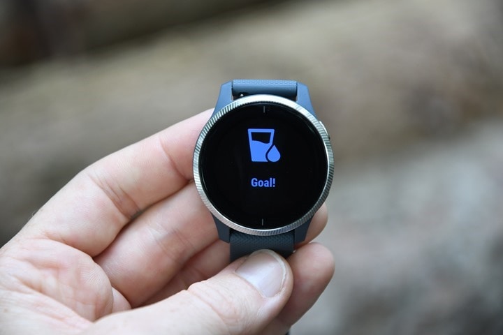
All of this can be customized to metric instead of cups, by the way. And you can add water within Garmin Connect Mobile and it should merge together (right now that’s not working for me). The whole point of this is largely water tracking. For those trying to lose weight, one of the best ways to support that is drinking lots of water (for a variety of reasons that Google can help on). You’ll see your goal progress (as defined in settings on the app) around the outside, and a little animation when you achieve it.
Garmin is approaching this feature much like the female menstrual tracking functionality they added the past spring in that it’s technically a Connect IQ widget that’s pre-loaded onto the Venu/Vivoactive 4 watches, but expect to see it expanded quickly.
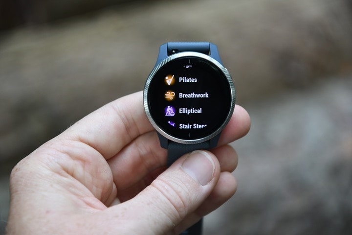
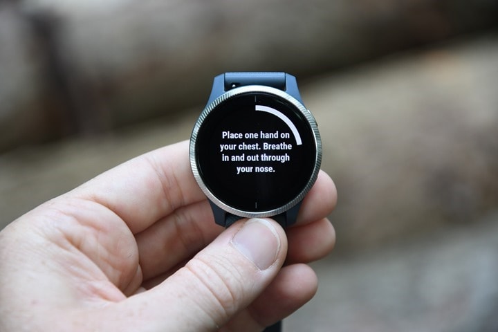
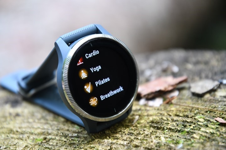
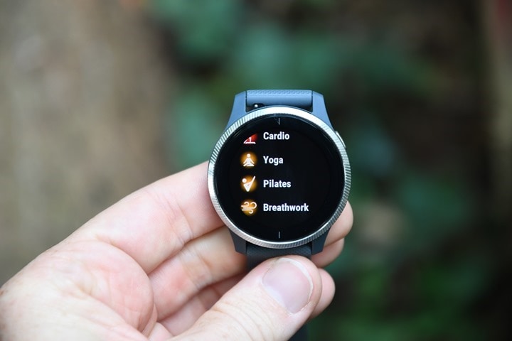
Next there’s the new breathwork features. Now, unlike typical “slowly breath in and out” features we’ve seen on various watches, this is at an entirely different level of breathwork, often called mindful breathing. For you endurance athletes, think of this like the mother of all structured workouts. And in fact, you’ll find it under the workouts section:
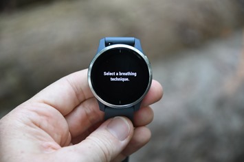
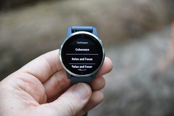
It’s here you can choose a specific breathing technique:
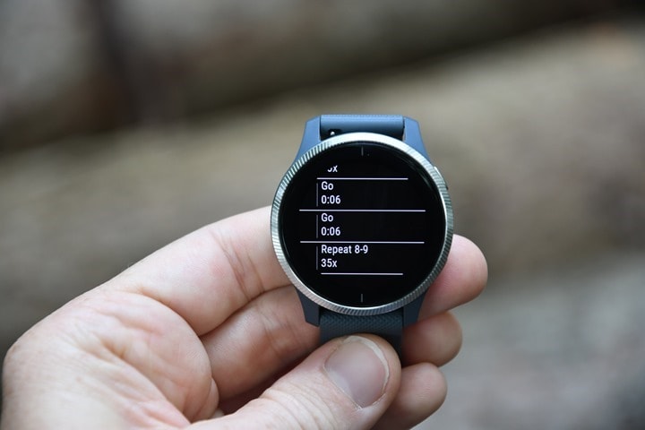
Once you’ve done that, it has all the steps listed. Seriously, some of these have repeats that list ‘35x’. Imagine if you had a track workout that said ‘Repeat 35 times’. Yikes.
And then it’ll guide you through those steps, with the count-down timer around the edge.
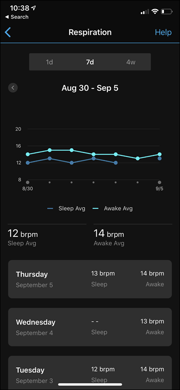
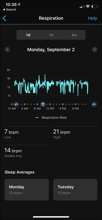
Now in certain activities you’ll also get the new respiration rate data. The new respiration rate feature does not require a heart rate strap, and is working constantly behind the scenes within the optical HR sensor to measure respiration rate (basically, breathing rate). You can see it on a dedicated widget on the watch, or via the health stats consolidated widget:
And then also see all the trending data on Garmin Connect Mobile within the respiration rate section under health stats. You can slice and dice by day or longer periods, and also get awake and asleep averages:
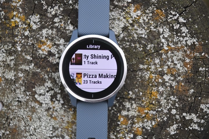
Beyond the above features, the vast majority of items you’ll see is virtually identical to previous Garmin watches. However, just more brilliant on Venu. For example, in the Spotify app, things just look prettier for the album covers:
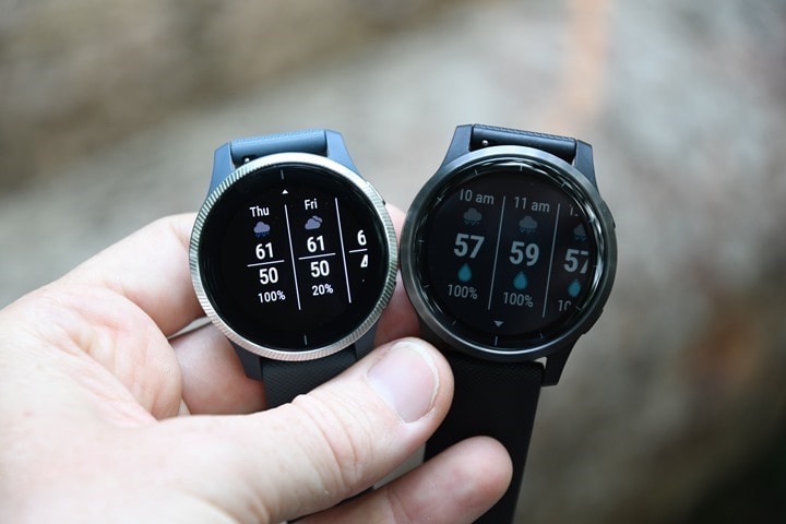
And as you saw earlier, for some of the widgets – like the heart rate ones, the trend lines are prettier. Even in the case where the overall widget structure hasn’t changed any, the colors are rendered far nicer than before. Here’s an example side by side of the weather widget on the Venu (left) and Vivoactive 4 (right). This really helps you see the display differences:
And again, this time for that heart rate graph:
Now finally, as I noted early on in this post, this isn’t a review. The reason it isn’t is because I haven’t compiled tons of workouts on it or worn it a bunch. It’s because at this juncture I don’t believe the firmware is final, and thus, it’s not representative of the units that will go to consumers. And in the case of both Venu and the Vivoactive 4, I’ve had a far rougher stability experience than I’d find acceptable at this point in time. I’m reasonably confident Garmin will be able to fix the issues I’ve stumbled on, but with announcement today, they aren’t yet fixed and thus I don’t believe they’re going to be shipping on this specific firmware version. Once I’ve got a final firmware version (the one they’re shipping to consumers with), then I’ll circle back with a typical full in-depth review. The point being, things will likely get better, but as always, it’s plausible they won’t.
Sports-Specific Details & Tests:
While many of the new features are within the general aspects of the watch (like hydration), a huge pile of them are technically under sports (including the breathing features I talked about in the previous section). We’ll first look at these new features, and then from there dive into a quick accuracy check-up on some runs and such.
But first we’ve gotta talk animations. No, not like Dory and Nemo, but rather workout animations. Other watches, most notably Fitbit, have been doing this for years in the strength and core workout realm. But there have been plenty of others including Adidas and Polar that have tackled this as well. In Garmin’s case there are four workout types (Strength, Cardio, Yoga, Pilates) with some 41 different structured workouts between them. Within that there are small little animated peoples that you can see the exact steps of the workout.
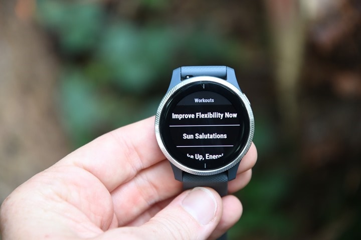
Here, let me show you. Let’s pick a yoga workout, first by going to the sport menu and choosing Yoga:
And then by swiping up to ‘Workouts’. It’s here that you’ve got a handful to choose from:
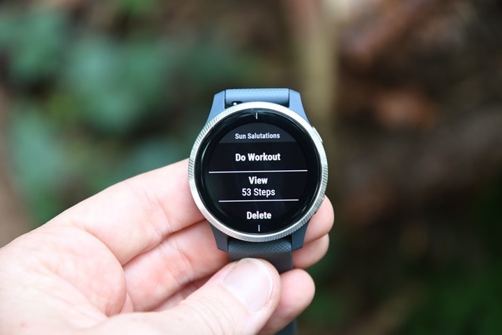
Pick one of them, Sun Salutations in our case because it’s early morning right now and the sun is rising, and then press to view the 53 steps of the workout:
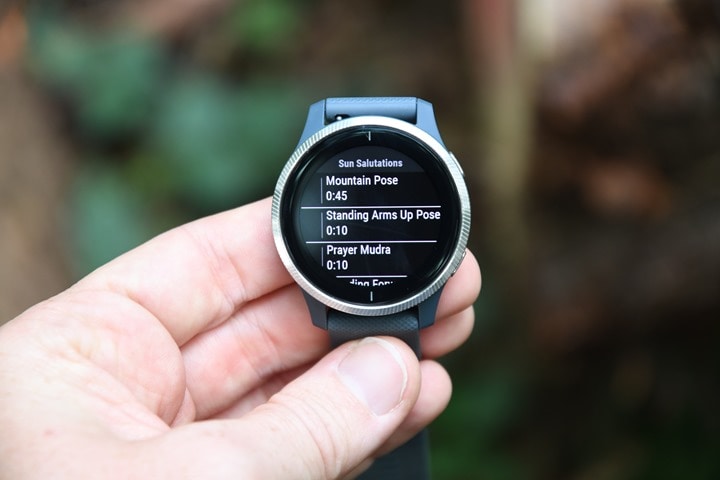
You’ll see each step listed with the number of seconds next to it:
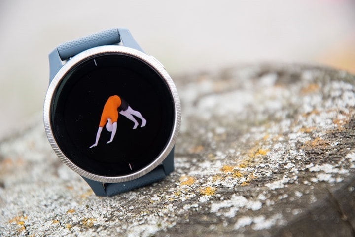
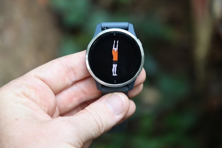
If you tap on a given item, it’ll go ahead and show you a short animation of that action:
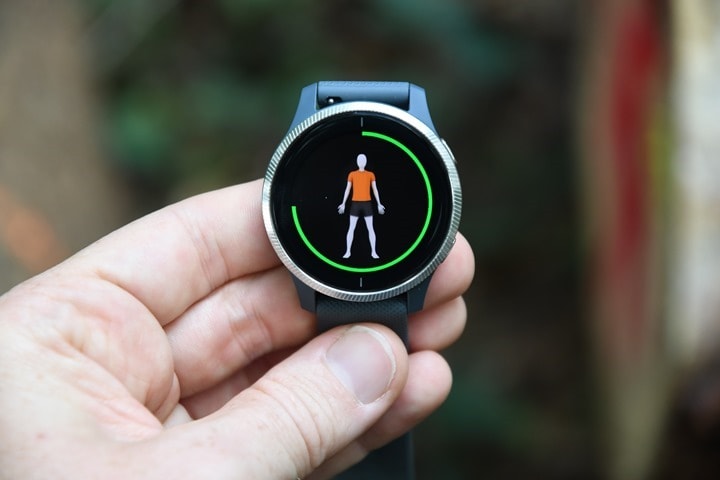
But let’s go ahead and actually start the workout. When you do that it’ll walk you through each step, with a timer around the outer edge of the step, and the inside for the pose itself:
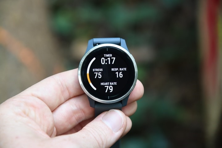
You can swipe down for a timer that’ll show you a count-down, or just wait for it to buzz for the next step instruction, with it giving the name of the pose, and a pie-chart style countdown clock:
You can see your heart rate on that clock page above, but also within a regular data field you can setup on a data page:
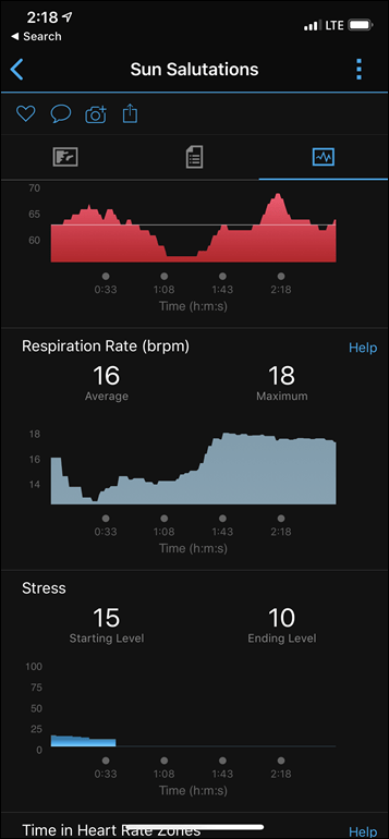
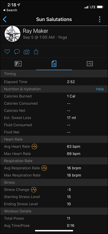
In fact, you’ll notice both the stress and respiration rate data fields are actually available there – something new on Garmin wearables and specific to Yoga and Pilates. After you’ve finished the workout the summary screen will even list the poses, as well as your breathing rates:
Now the overall poses/animations concepts are essentially the same whether you’re in yoga, Pilates, cardio, or strength. Obviously the specificS for each workout are different, but the way the Garmin unit works is the same. With strength training you’re also getting rep-specific information too.
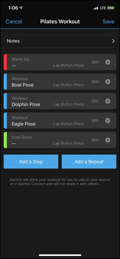
However where it really starts to get interesting is that you can create your own workout with the animations from Garmin Connect/Garmin Connect Mobile:
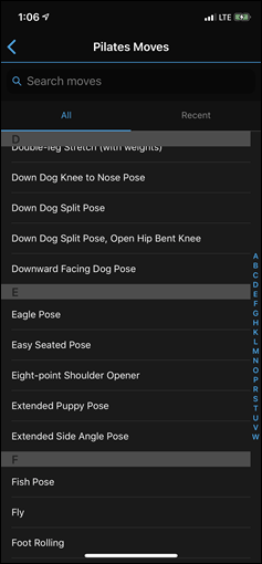
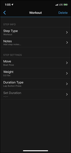
Though, at present you don’t see the animations in Garmin Connect Mobile, but, they will show up once you get onto the device itself.
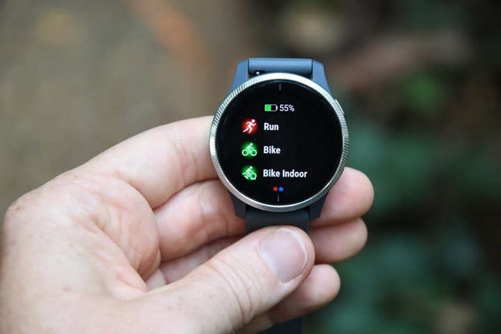
Let’s switch gears now. Taking a look at accuracy a bit, as well as the new sweat loss functions, and no better way to do that than an interval workout. In my case, I just did a manual workout, though the Venu does support structured workouts. To start a run I simply tap the upper right button once, and select run from the list:
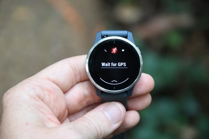
The GPS status and heart rate lock will also show up top:
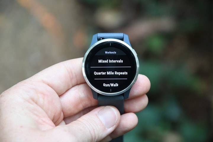
And if you wanted to execute a custom workout you’d just swipe from the bottom to access the workouts section:
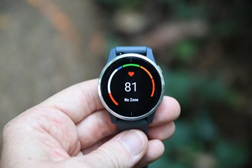
Then, it’s off I went on my run. In my case, just a couple of loops for a 5-6KM run after a long day driving to the convention halls. Nothing special. The display remains on the entire time I’m in my workout, so I don’t have to worry about waiting for it to illuminate when I glance at my wrist. Beyond that, it works just like any other Garmin watch in terms of showing you your running stats in customizable display pages:
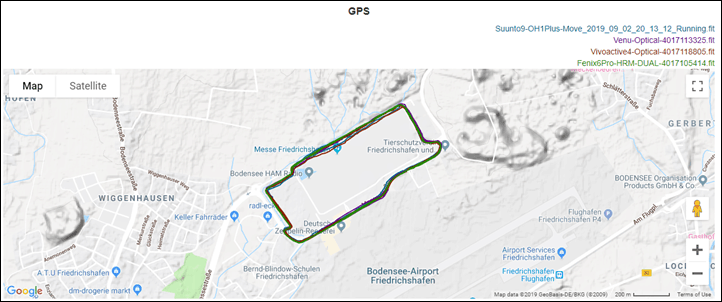
Let’s start though by looking at GPS accuracy. In this case I’ve got it slated up against the Garmin Fenix 6 Pro (with the HRM-DUAL chest strap), the Suunto 9 (paired to the Polar OH1 Plus optical HR armband), and the Vivoactive 4. Full data set:
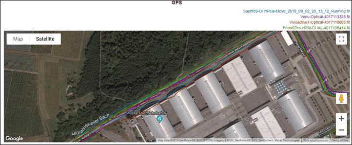
At a high level it looks mostly good, but let’s zoom in on one of those sections that looks a bit wobbly:
You can see in that on the upper side there’s a unit (the Vivoactive 4) that’s doing some meandering into the convention halls. It did this on one pass, but not the secondary pass.
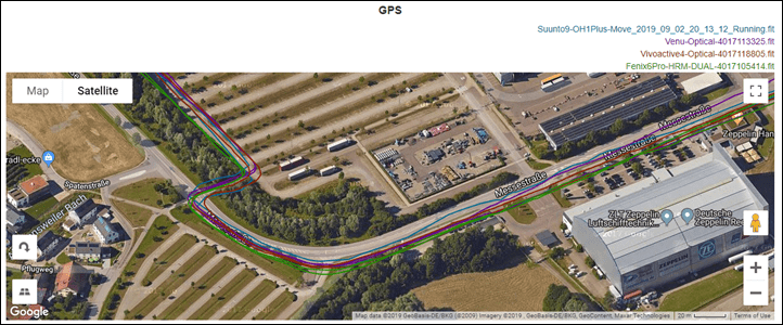
As for the Venu though, it matches the other tracks perfectly, and most notably – matched where I actually ran each time:
In general, this roughly matches what I see for the Venu and Vivoactive 4 in terms of GPS tracks. For the most part it’s good, but there’s also some runs where it’s a bit wobbly. Which I suppose is sorta the gist of things on the Sony chipset across the board, including Suunto and Polar (in fact, if you look at the linked data set, you’ll notice the Suunto 9 cuts a corner in the parking lot a bit too).
So what about heart rate accuracy? We’ll dig into that too – this compared against the HRM-DUAL chest strap and the Polar OH1 Plus optical HR sensor.
Ahh yes, the good ol’ classic evening fall run chest strap lack of connectivity (despite wetting it). It’s rare, but this night was more akin to a fall evening than a summer one, with cooler temps, and you can see that green line of the chest strap lagging. Though, from an optical heart rate standpoint all the units were very close on the intervals.
If we zoom into one, we do see the laggyness of the Venu & Vivoactive optical HR sensors though:
You can see the delay of both in comparison to the chest strap and Polar OH1, which more quickly adapt to the increased heart rate through each interval. But the delay isn’t horrible, at least compared to some. Keep in mind the graph directly above makes this look much longer than it really, so ensure to look at the timescale.
Again, in my full review I’ll go through more data sets and dive into all the nuances. But the above dataset is largely representative of what I’m seeing across the board for accuracy (both good and bad).
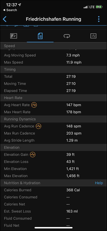
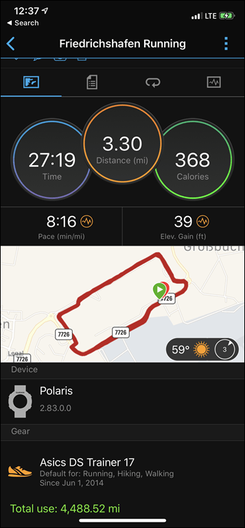
Finally, the last new feature to touch on is sweat loss. After you upload an activity to Garmin Connect it’ll show you the estimated sweat loss leveraging the known outside temperature, your weight, humidity, and general black magic. You can see for this short 27 minute run, it was 163ml of liquid (lower right hand corner of right screenshot):
Ultimately, I suspect for most customers of the Vivoactive series units, this probably isn’t too much of a concern. But where it could be more interesting is on the higher end watches (which it’s coming too shortly) in terms of longer endurance workouts. At this point I haven’t done any weighing pre and post workout to validate this, but maybe if I get some nice warm days I will.
Wrap-Up:
When Garmin first talked to me about the AMOLED display on the Venu, I was concerned they’d be leaving behind all the features that made a Garmin watch…well…a Garmin watch. The longer battery life and the always-on display. But it turns out they’ve balanced that pretty well. From the first day I’ve been using the Venu, I switched it into always-on display mode, and have been pretty good with it. Sure, it still turns off the display at night, but I can press a button to see the time pretty easily. All this while largely keeping battery life to the point where I only need to charge it 1-2 times a week depending on exact activity/usage.
All that said, I feel like Garmin sorta punted on actually taking advantage of the display. Sure, the 4 second long watch-face animation is cool, but realistically it gets old after a few days. Beyond that – there’s virtually nothing else that embraces it in a significant way. Yes, there are the new workout animations – but those same animations are there on the new Vivoactive 4 too – just not as bright and colorful. There’s no other aspect of the watch that actually visually takes advantage of the display in any uniquely Venu way besides being crispier (which, to be fair is appreciated). As I noted early – the workout completion screen is probably the most glaring example of that.
Garmin’s watches are all about the workout, and yet the Venu has the lamest and most boring workout completion screen possible. No other Garmin device is as plain-Jane monochromatically boring at this one upon completing that workout. No map outline like Garmin’s other new watches, and certainly not a full color map like the Apple Watch displays. No nifty brilliant display graphics to perhaps show heart rate zones or anything else. Anything, really…just anything would have been better on that screen.
But hopefully that’ll come in time. And I suppose for now they just need the watch to be a bit more stable first, before they start adding more features. Like I said at the start of this section – while I was concerned that the Venu and its swanky display might undermine Garmin’s reputation around battery life – that’s turned out not to be the case. And perhaps now I fall on the other side of the camp: Now it’s actually time to leverage it. Just a tiny bit more.
With that – thanks for reading, and stay tuned for an in-depth review down the road!
—
Heads up: You can pre-order both the Venu & Vivoactive 4 series via Clever Training. Doing so helps support the site here, and if you use the DCR/CT VIP program, you’ll get 10% back in points you can use immediately, plus of course free US shipping. Thanks for the support!
https://www.dcrainmaker.com/2019/09/garmin-venu-with-amoled-display-everything-you-ever-wanted-to-know.html
2019-09-05 10:07:30Z
52780374121616




Tidak ada komentar:
Posting Komentar