-
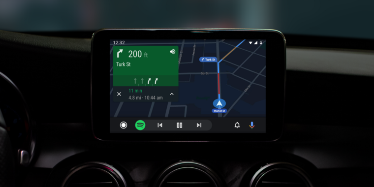
The new Android Auto. The big change is the system bar at the bottom, which can now show tiny app controls. Here are music controls.
-
For reference, this is the old Android Auto.Google
-
With the music open, you'll get turn-by-turn information in the bottom bar.Google
-
This used to be the Android Auto home screen, but now it lives under the "bell" icon.Google
-
This is the new home screen, a grid of app icons.Google
-
Icons with the Google Assistant badge aren't really apps. They will verbally read you specific information.
-
Here's an incoming call.Google
-
The split screen mode for wider displays.
Earlier this year at Google I/O, Google announced a big upgrade to Android Auto, its smartphone-powered car interface and competitor to Apple's CarPlay. Now, around three months later, the interface is finally rolling out to the general public via an app update. This version of Android Auto represents the interface's first major upgrade since its launch in 2014.
The biggest change to this new version of Android Auto is the way the bottom system bar works. The old version of Auto used the bottom bar kind of like a MacOS app dock. It housed shortcuts to your Maps, Contacts, and Music apps, but it also mixed in system-level navigation icons for "Home" the useless "car" screen. The new version does away with all that, sticking a home button on the left, a notification and voice command button on the right, and a middle section that keeps important controls at your fingertips.On a smartphone, Android will spawn controllable ongoing notifications for things like currently playing music or Google Maps navigation, and the middle section of the bar kind of works the same way. If you're playing music and not on the music screen, you'll see music controls. If you're navigation and not on the maps screen, your next turn-by-turn direction will pop up instead. This is a big boost to the ability to multitask on the car display—just make sure you're paying attention to the road, too.
With app shortcuts booted out of the bottom bar, app selection is now done from a tried-and-true app grid. The home button opens this screen, which features a top row of predictive app icons and then a boring alphabetical list below that. The "Bell" icon brings up a list of notifications that looks a lot like the old Android Auto home screen, and the microphone button brings up the omnipresent Google Assistant.
The interface gets a darker color scheme, and for even more multi-tasking power, there's now support for split screen apps if you have a wider car display. The wider display layout makes the navigation bar a vertical strip on the left side of the screen, followed by the main interface. The shorter vertical navigation bar means there's no room for the middle app bar, so that information gets blown up to a second app panel. Presumably this changes as you navigate around the OS, just like the app bar.
In other Android Auto news, Google is also announcing that the standalone mode for the Android Auto smartphone app is going away. The version above has the phone plug into specifically compatible cars, and then the phone beams an interface over to the car display (essentially using your car like a big, external touchscreen monitor). For people that didn't have a compatible car, the standalone Android Auto could previously present a similar interface on your smartphone display. Google is killing the smartphone-only functionality of the Android Auto app, and the company will instead integrate a "Driving mode" into the Google Assistant.
Listing image by Google
https://arstechnica.com/gadgets/2019/07/android-autos-first-big-redesign-is-finally-rolling-out/
2019-07-31 15:25:00Z
52780342587953
Tidak ada komentar:
Posting Komentar